Female head, Cypriot, early 5th century B.C., rendered in limestone pixels
James Langdon
A project of 019 in collaboration with Design Museum Gent
James Langdon is an independent graphic designer and writer and professor for Communication Design at the Hochschule für Gestaltung Karlsruhe.
The billboard on the side of Design Museum Gent in Drabstaat is an ongoing project of the Gent graphic design collective 019, providing an alternative exhibition platform for graphic designers. Every design remains in place for 2 months. The 50 sq.m. billboard is all that remains of the exhibition project 019 — Museum Of Moving Practice from 2017, during which the collective temporarily occupied a section of the museum. Billboard is based on the Billboard Series concept on the wall of the 019 building in Dok Noord since September 2015 (a joint project of artlead, All Things Contemporary Vzw & 019).
Previous billboards
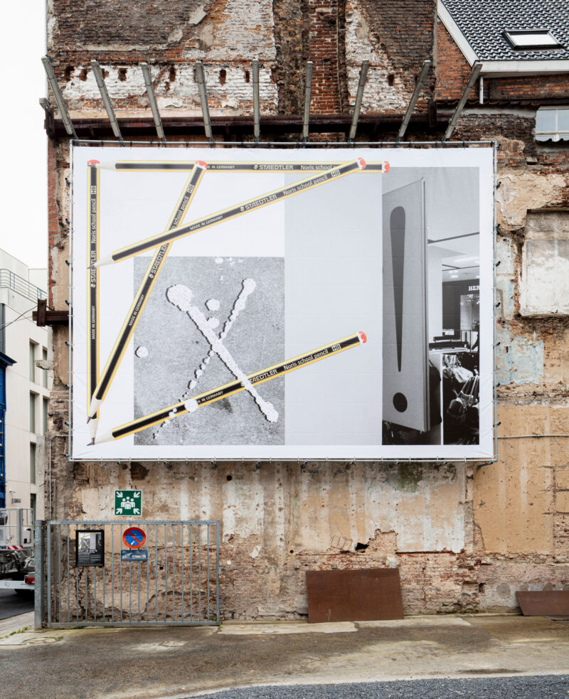
Bart de Baets – x! (Composition with lost signs and pencils)
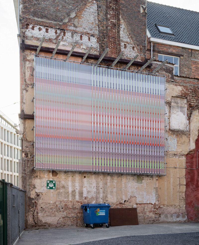
Stephanie Specht – Location Does Not Matter.
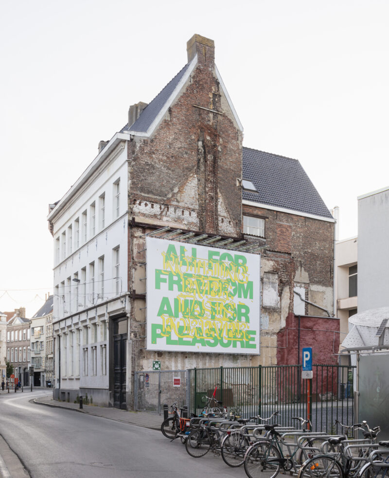
Jiri Mocek - Nothing Ever Lasts Forever
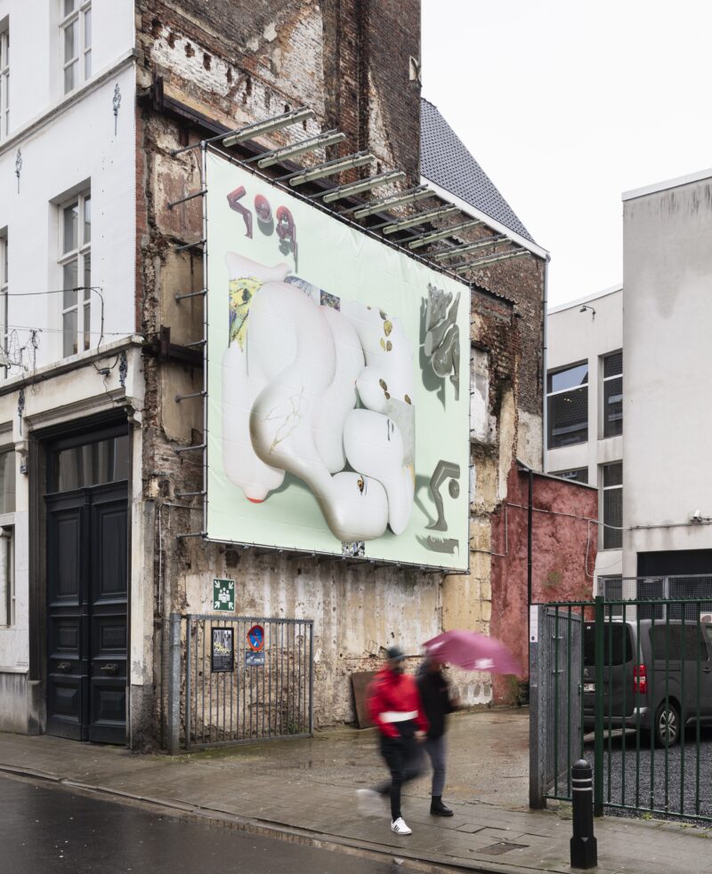
Kevin Bray – it is a imbroglio
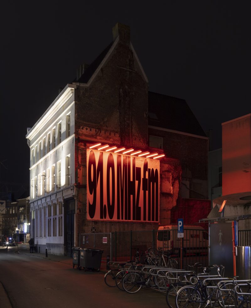
Phantom Radio – Talking Letterheads
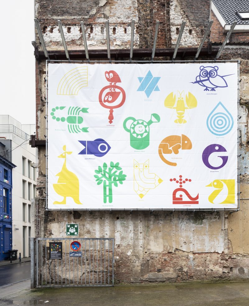
Sara De Bondt – Off the Grid
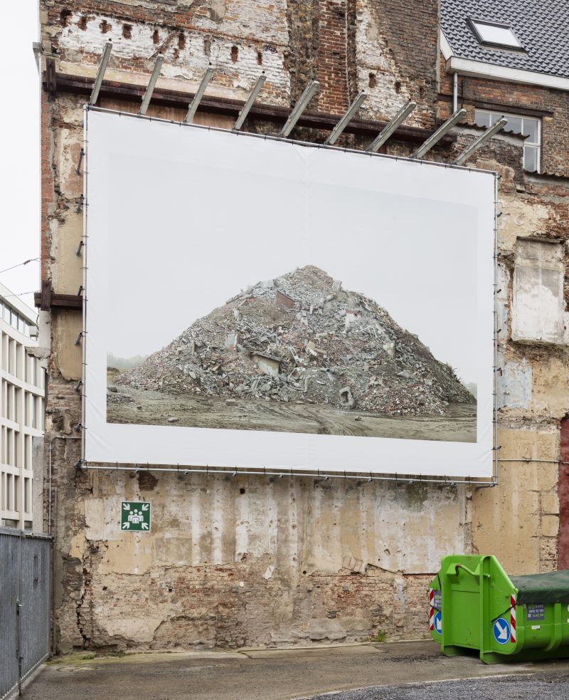
Filip Dujardin – memorial IV
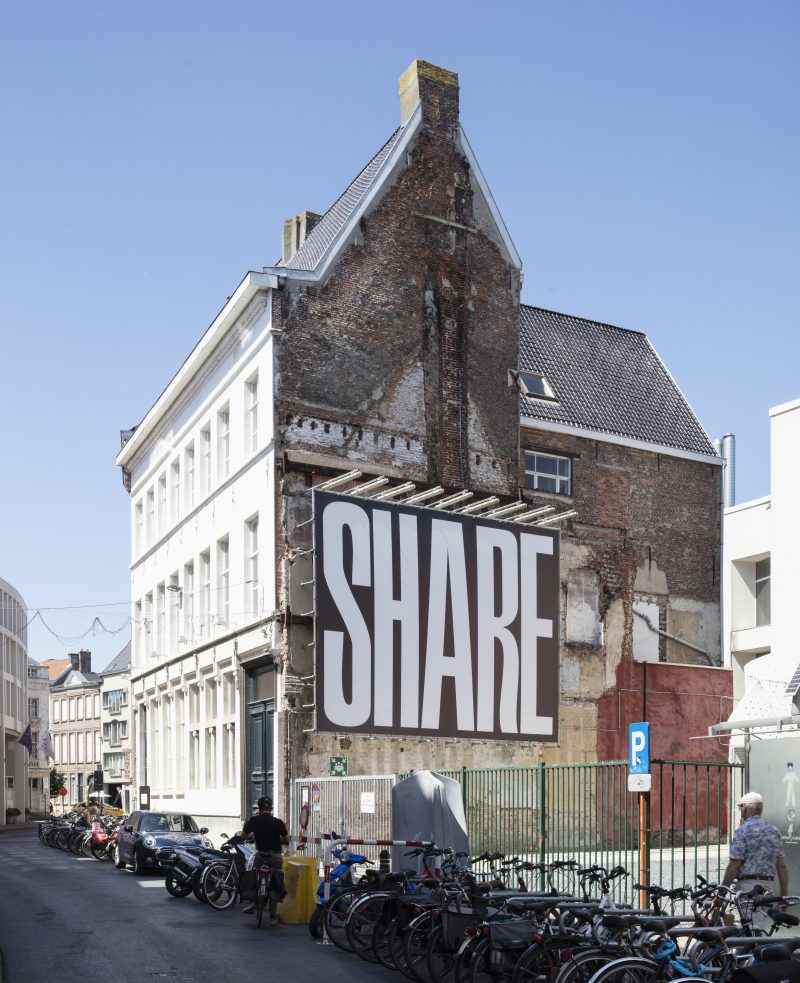
Ines Cox – Show
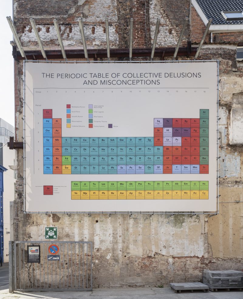
Agnieszka Kurant – The Half Life of Facts
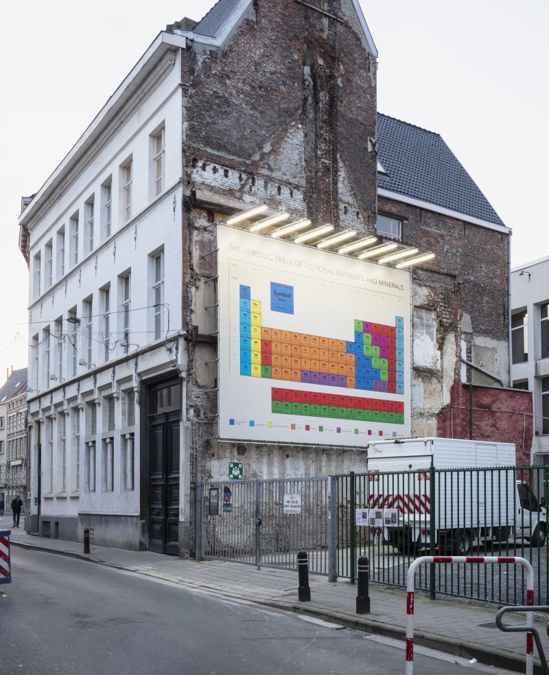
Agnieszka Kurant – The Half Life of Facts
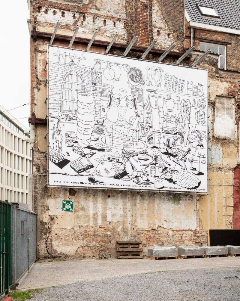
Moriz Oberberger – “While I was filling the container with water...”
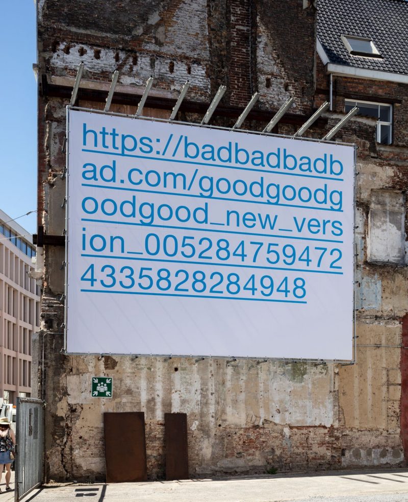
Braulio Amado – ≃01:05:24
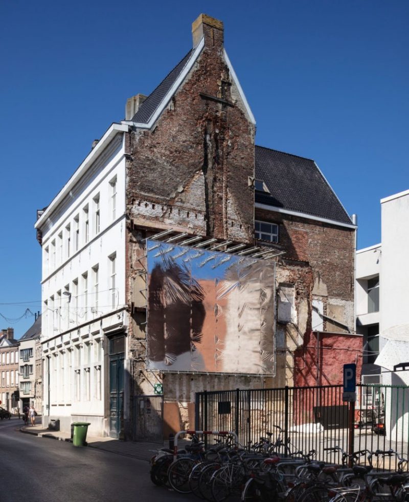
Bieke Criel - Mylar Silver 5,7 x 7,3
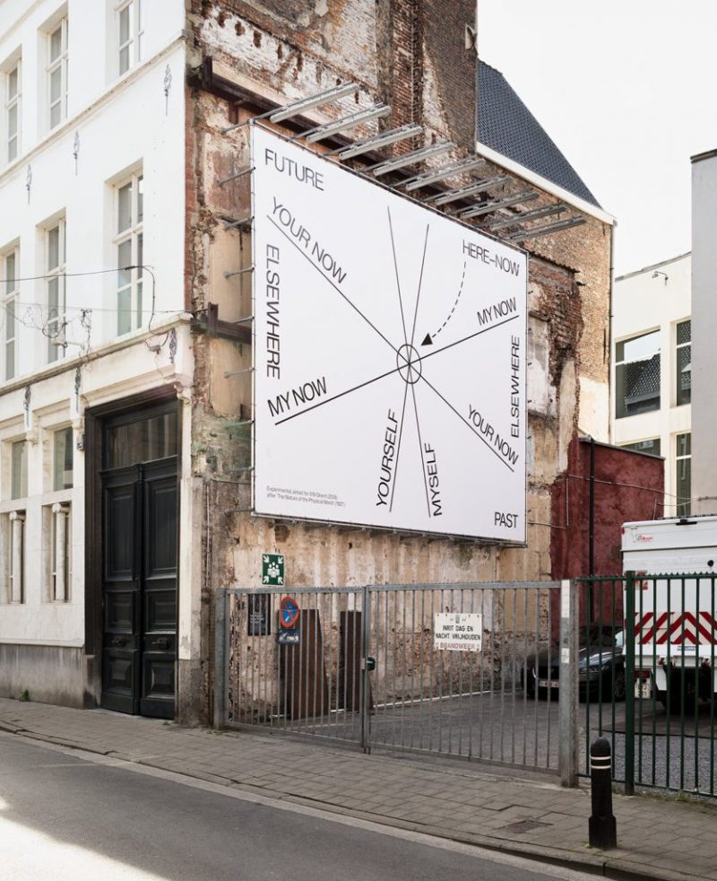
Experimental Jetset
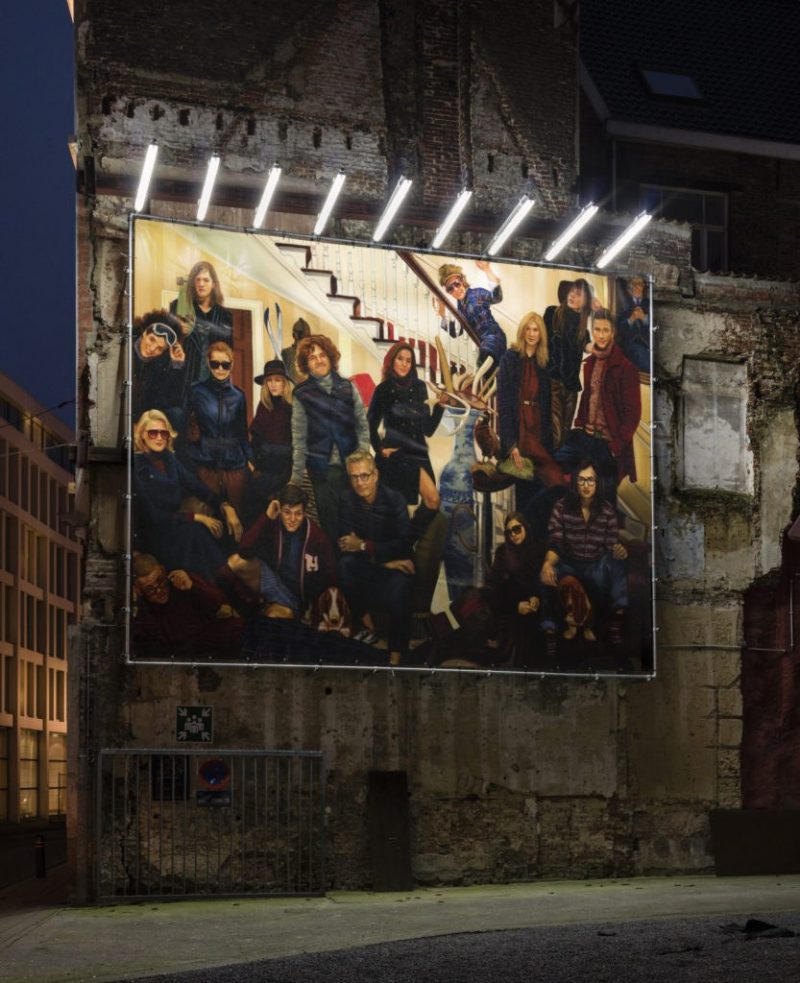
Ine Meganck - Ghost (Family) Paintings
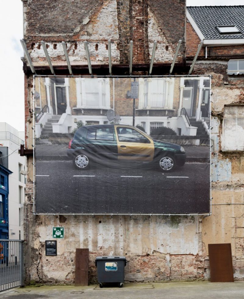
Daniel Eatock - Visible Vehicle Repair
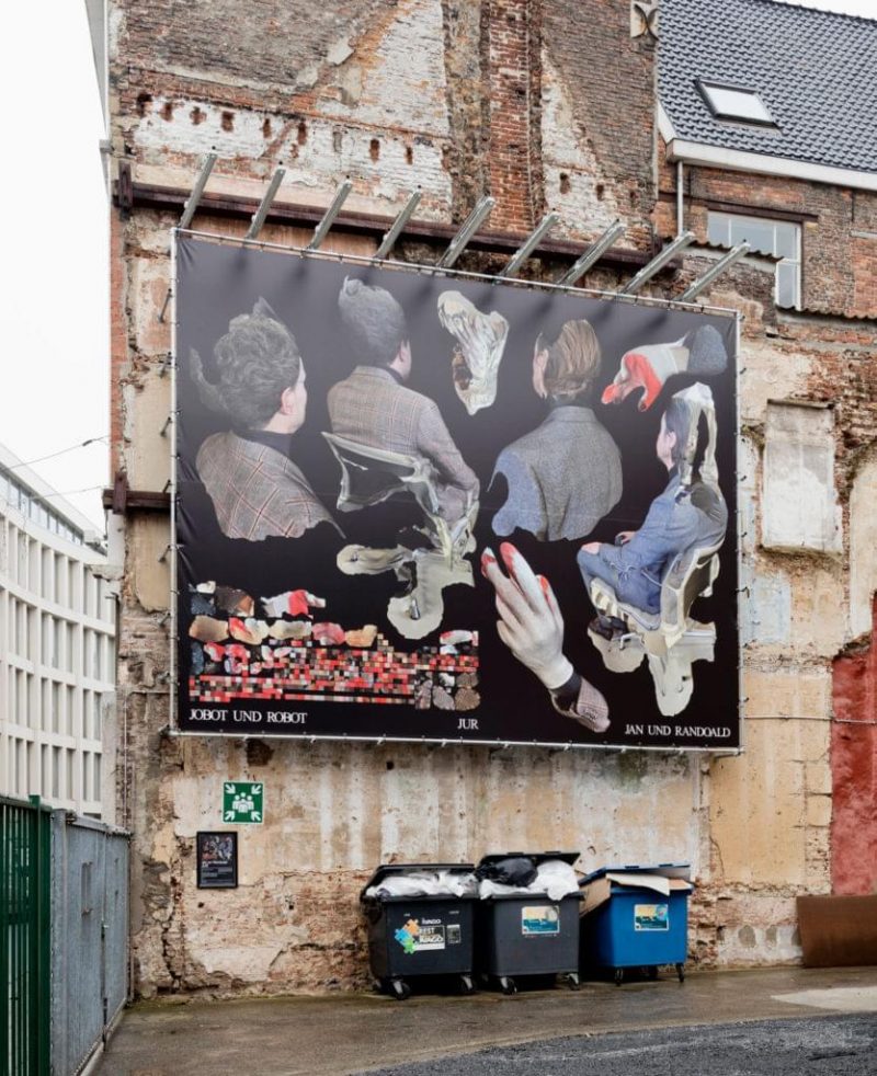
JUR by Jan Und Randoald
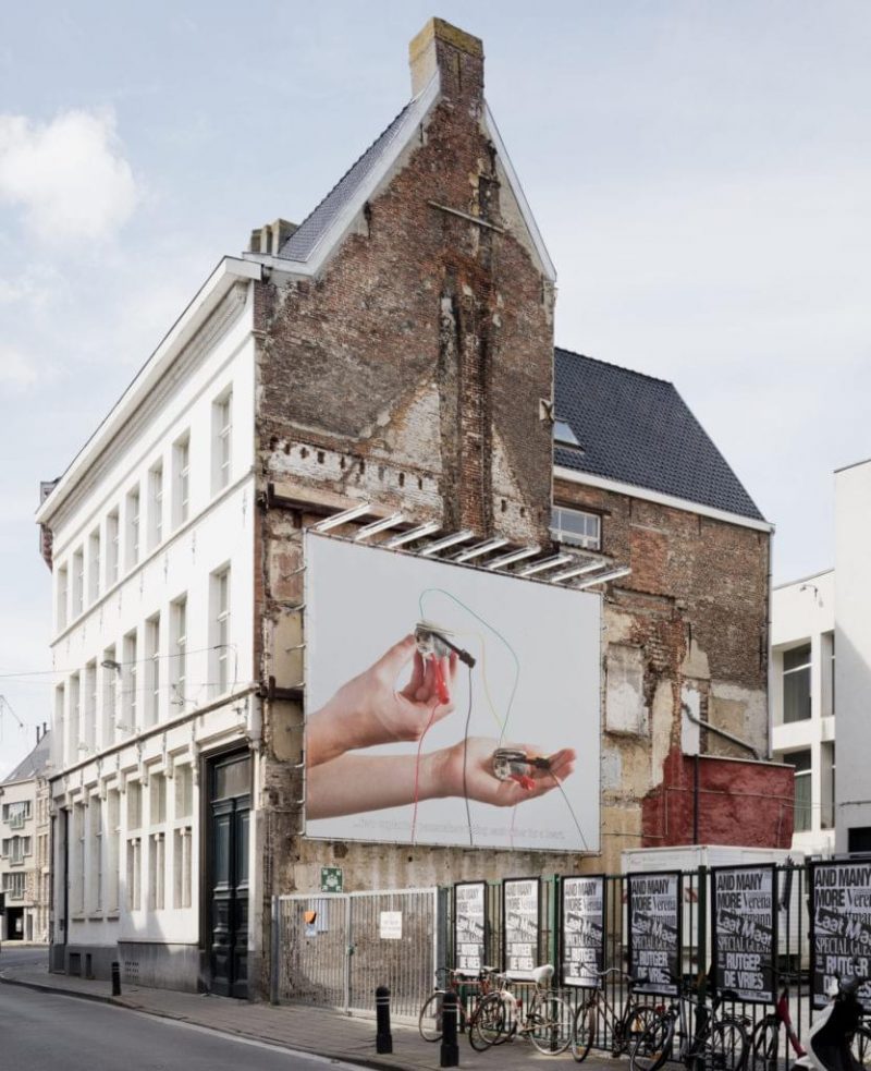
Transitory Nature Three selected episodes from Reference Guid, a growing encyclopaedia on ships, forests and pacemakers
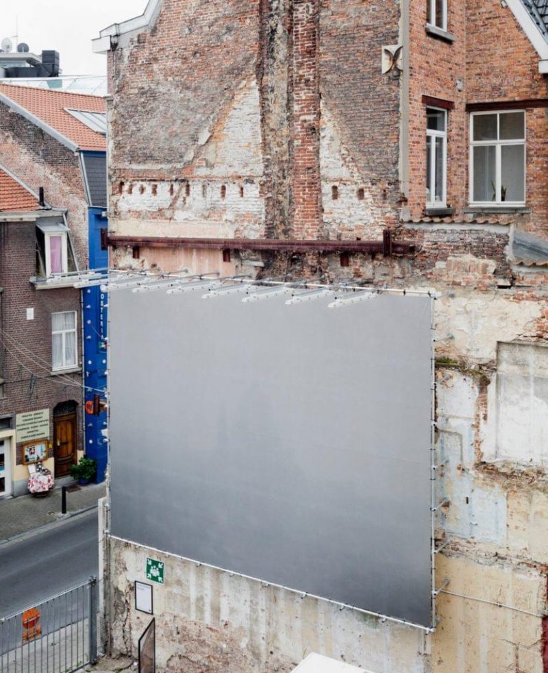
Lydia Debeer - Absence Makes The Heart Grow Fonder
Karel Martens - Motion

Selección Natural – This is the Cover of the Book
x! (Composition with lost signs and pencils)
Bart de Baets (Knokke BE, 1979) graduated from the graphic design department of the Gerrit Rietveld academy in 2003. He has since then been living and working in Amsterdam. De Baets designs graphic identities for lecture programs, exhibitions and performance events. In addition, he designs books and record covers. In 2016/17, Bart was a guest professor at the Communication design department of the Hochschule für Gestaltung in Karlsruhe. He has been teaching design at the Gerrit Rietveld academy in Amsterdam and at the Royal Academy of Arts in The Hague since 2009.
Location Does Not Matter.
Stephanie Specht (°1982) is an Antwerp-based graphic designer who graduated from the Royal Academy of Fine Arts (Antwerp) in 2004. Having lived and worked pretty much everywhere in her 14-year career (Cape Town, Brussels, Princeton, New York, Antwerp), every single one of these experiences shaped her as a creative person. The pattern of her billboard, titled Location Does Not Matter, consists of several illustrations of houses based on some of her drawings when she was a child. As a symbol of the many places where she has lived, they were strongly compressed to emphasize the full feeling. The whole becomes very abstract from a distance, almost a haze - the depth disappears, just as memories of the details of the houses gradually disappear and only an atmosphere remains. The integration of intuition in her work has recently become increasingly significant to Specht. The ability to reinvent herself from time to time is of high importance; when the need for change is there she wants to act upon it.
Nothing Ever Lasts Forever
Political promises. Possible power. Manipulated altruism. Fake help. Possible changes. True dangers. Never-ending speculations. Forced suggestions. Unfortunate consequences. Who wants to rule the world nowadays? It’s important more than ever to keep in mind that nothing ever lasts forever, as the Tears For Fears lyrics go.
it is a imbroglio
Kévin Bray’s work oscillates between several media – namely video, graphic design, and sound design – through which he questions the existence of the image and its (modes of) production. To what extent is a still image time-related? How do media and format interact and influence each other? He tries to understand how the form and language of a particular medium are visualised and manipulated, in order to impose those codes onto another medium. His interest lies in playing with the possible porosity created by confrontation and through this methodology he aims to open and diversify a language while exploring the edges of its possibilities.
Talking Letterheads
An interview marathon by Phantom Radio with contemporary Belgian graphic designers, hosted by Gerard Herman & Dylan Belgrado. Coordinated by Sara De Bondt, Ronny Duquenne, Valentijn Goethals, Ine Meganck and Jeroen Wille. Part of the exhibition Off the Grid. Belgian Graphic Design from the 1960s and 1970s as Seen by Sara De Bondt.
Off the Grid
This billboard depicts sixteen logos created by seven graphic designers during the 1960s and 1970s in Belgium. Made for banks, restaurants, theatres, paint companies, museums and others, they are all pictograms with a reference to nature. Aimed at the many Christmas shoppers and tourists that walk past the museum every day, the selection’s subliminal message is a call for more awareness of our planet.
Produced on the occasion of the exhibition Off the Grid. Belgian Graphic Design from the 1960s and 1970s as Seen by Sara De Bondt at Design Museum Gent.
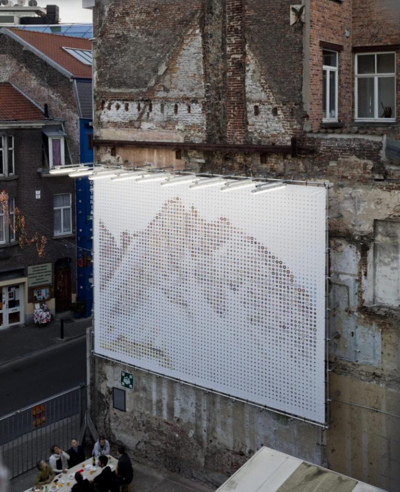
memorial IV
The photo collage memorial IV is part of a continuously expanding series of memorials, in which Filip Dujardin examines art-historical archetypes, incorporating them in new image compositions. Architectural fragments are extricated from their geographical context and time frame, and rebuilt in a new spatial environment. By combining elements of different architectural origins, he compresses (the architecture of) art history, creating new tensions.
memorial IV depicts a gigantic pile of rubble with fragments, shards, and crushed or hacked construction materials.
The image compels you to contemplate it before you become aware of the improbability of what you are seeing. Fragments of demolished 18th century town houses, crumbled marble Corinthian columns from a Greek temple, and reinforcement steel from modernist high-rises with concrete frames and precast concrete units are all piled onto a large concentrated unit in the pixel heap. A mountain as a remnant or a memorial to a demolished imaginary construct.
Show
Feeds glide before our eyes, fingertips tap-dance on glass surfaces and while we scroll deeply into an endless universe, we view, tag, like and comment. Publishing became posting and posts appear on walls and in groups. The vocabulary, with which the software on our computers and phones talks to us, is full of metaphors related to the physical world. A story can mean different things now.
Ines Cox (°1987) is a Belgian graphic designer running her own independent studio in Antwerp. In 2009 she graduated from Luca School of Arts (Ghent, BE) and continued studying for a second Master course at Werkplaats Typografie (Arnhem, NL). She has been collaborating with a wide variety of artists, institutions and brands on both printed and digital matter. In her practice, commissioned projects run parallel to self-initiated autonomous work and research. Once a week Ines teaches Typography at the Graphic Design department of the Royal Academy in Antwerp and from January 2017 until the end of 2018 she has also been a researcher there.
The Half Life of Facts
Conceptual interdisciplinary artist, Agnieszka Kurant explores how complex social, economic and cultural systems can operate in ways that confuse distinctions between fiction and reality or nature and culture. She investigates ‘the economy of the invisible’, in which immaterial and imaginary entities, fictions, phantoms and emergent processes influence political and economic systems. Kurant probes the ‘unknown unknowns’ of knowledge and the speculations and exploits of capitalism by integrating elements of science and philosophy, and analysing certain phenomena — collective intelligence, emergence, virtual capital, immaterial and digital labour, evolution of memes, civilisations and social movements, artificial societies, energy circuits and the editing process — as political acts. She explores the hybrid and shifting status of objects in relation to value, aura, authorship, production and circulation. Many of her works emulate nature and behave like living organisms, self-organised complex systems or bachelor machines.
“While I was filling the container with water...”
Here you meet Herta, an old lady. This fictional character is for Moriz Oberberger an intimate partner for conversations. Herta brought her daily life actions to perfection. She is the personification of the present. Her life experiences brought her to this point. Herta’s life is unscheduled, although she has absolutely no spare time. Every movement leads simply to the next one. It makes her aware of the essential creature of herself.
For the occasion of this billboard, Herta is in the WT building, more specifically in the kitchen. The kitchen is the heart of this school. It is the social meeting point for the first coffee of the day, for communal lunches, discussions and games. It is a space where new ideas occur. This scene is therefore a snapshot of a typical situation during a WT day, where the environment constantly transforms, gives new input for the work and where you occasionally will come across traces of other participants.
Moriz Oberberger is an Italian graphic designer and illustrator currently a participant at Werkplaats Typografie (WT), a design school in Arnhem, Netherlands. In his work, Moriz explores the interaction between the insignificance and significance of daily life activities. He focuses on mundane everyday actions, the ordinary objects people use and the settings they are placed in. Subtle observations evolve into a manifold of hidden stories from parallel worlds captured with a playful tone of voice. These narratives are exercised in different mediums, ranging from drawings, stories, books and games.
The Werkplaats Typografie (WT), part of the ArtEZ University of the Arts, is a two-year graphic design masters programme founded in 1998. The WT is centred on self-initiated projects and assignments with lectures, encounters, seminars, meetings and readings geared towards self-accountable and independently motivated work and research.
≃01:05:24
Bráulio Amado is a graphic designer and illustrator from Portugal, currently living in New York City. Previously, he worked as a designer at Pentagram NYC and then joined Bloomberg Businessweek as an art director before moving to the New York office of Wieden+Kennedy. Today, he runs his own studio, BAD Studio — Braulio Amado Design Studio.
Mylar Silver 5,7 x 7,3
A one-day billboard by Bieke Criel.
Experimental Jetset
The design of Experimental Jetset (a graphic design collective, Amsterdam, NL) refers to public instructions in an urban setting, such as city maps, floor plans, charts, road signs, etc. The graphic representation of the location also serves to indicate time, creating a map of time and space. The design is also based on an existing diagram, taken from a book called The Nature of the Physical World (1927). While this project looks very functional, it is also quite mysterious.
Ghost (Family) Paintings
As a graphic designer, Ine Meganck is fascinated by ghost families who often return within advertising. She collects, analyses and tries to reveal changes and patterns within these artificial families. For this billboard, Ine presents an enlarged winter advertisement of the brand Tommy Hilfiger. Some characters — the mother and father for example — always return through many years of different campaigns. But the art directors have fewer problems with changing and replacing children and pets throughout the seasons. Although there is a lot of attention spent to produce absurd details such as the paintings in the background. These are custom made to present the family tree as convincing as possible. This again contrasts with the fact that both grandmother, mother and grandchild are portrayed with almost the same youthfulness and style. Ine stripped the family of their literal brand references and had the image painted on canvas, in this case by a trained Indian paint-on-demand portrait painter. Ending up (again) with a dislocated family portrait that, because of its location and dimensions, seeks duality again with the world of advertising.
Visible Vehicle Repair
British artist and designer Daniel Eatock, known for astute observations and obsessive collecting, creates works which whimsically celebrate the mundane and question accepted convention. By capturing auto repairs where a part is substituted by one from another vehicle of the same model but of a different colour, Eatock’s photographs focus on a practice in plain sight, on economic and transparent fixes. Recognising a connection with art conservation — where repairs are meant to be visible rather than camouflaged — as well as with the Japanese art form of kintsugi, where pottery repairs are illuminated rather than hidden, Eatock elevates a thrifty practice to a place where it can be considered and appreciated as an aesthetic choice. Are these repaired vehicles richer, more valuable and better as a result of accident and repair?
JUR by Jan Und Randoald
JUR
Robots of the world! The power of man has fallen!
A new world has arisen: the Rule of Jobot und Robot!
March!
ACT I
Central office of the factory of JUR
Entrance on the right. The windows on the front wall look out on the rows of factory chimneys. On the left more managing departments. JOBOT is sitting in the revolving chair at a large American writing table. On the left-hand wall large maps showing steamship and railroad routes. On the righthand wall are fastened printed placards. (JOBOT UND ROBOT’s Cheapest Labor etc.) In contrast to these wall fittings, the floor is covered with a splendid Turkish carpet, a sofa, leather armchair, and filing cabinets. At a desk near the windows ROBOT is typing letters.
JOBOT (dictating)
Ready?
ROBOT
Yes.
Two explanted pacemakers taking each other for a heart
A billboard by Michiel De Cleene as part of his project Reference Guide.
Absence Makes The Heart Grow Fonder
A billboard by Lydia Debeer as part of the eponymous exhibition.
Motion
A billboard by Karel Martens as part of his exhibition Motion.
Selección Natural – This is the Cover of the Book
A billboard by Moritz Küng as part of the eponymous exhibition.
You might find this interesting too:
- ExhibitionRead more...
Home Stories
100 Years, 20 Visionary Interiors
- PaginaRead more...
With kids
- ExhibitionRead more...
The Desk
- ExhibitionRead more...
Object Stories
A Look at the Collection